One of the most powerful, yet often underestimated, levers in shaping those impressions is color. Beyond aesthetics, color is a psychological tool that influences mood, trust, and purchase intent. For furniture brands, harnessing color psychology across ad creative, landing pages, and catalogs can be the difference between an idle browse and a completed order.
Why Color Matters in Marketing
Color psychology is the study of how hues affect human perception and behavior. Numerous studies show that color significantly impacts brand recognition, product perception, and buying decisions.
- Research suggests that people form an opinion about a product within 90 seconds, and 62–90% of that judgment is based on color.
- Brand recognition can be increased by up to 80% via consistent use of color in visual identity.
For furniture brands, this is critical. Furniture is not just functional—it’s personal, emotional, and tied to lifestyle aspirations. The colors you use in advertising and digital experiences help frame how customers imagine your pieces fitting into their lives.
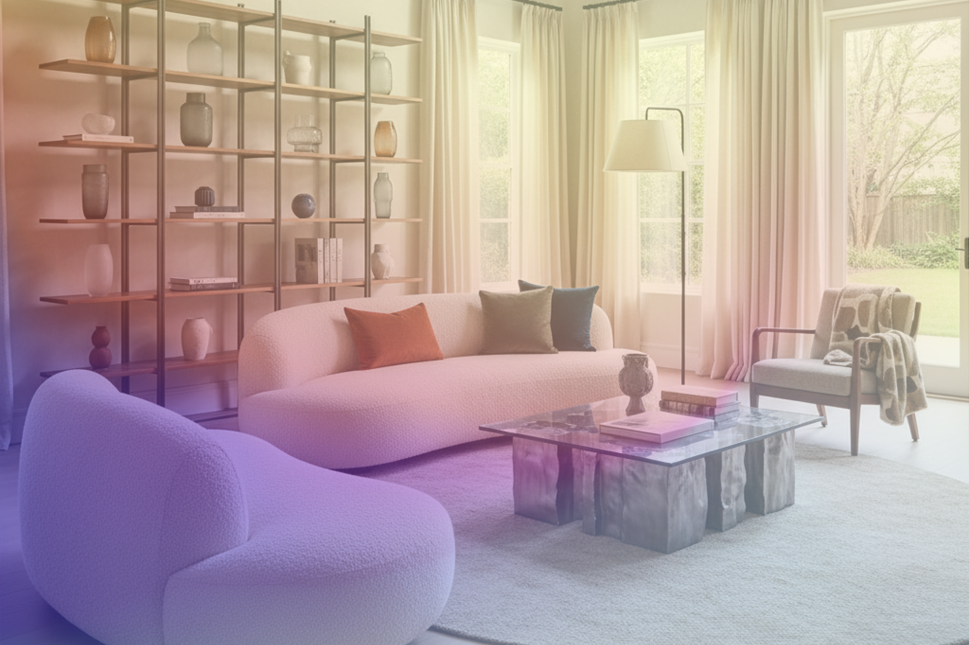
Color and Emotion: The Furniture Context
Each color family carries emotional associations. While interpretations vary by culture and individual experience, some broad psychological connections hold true—especially in Western / global interiors:
- Warm tones (reds, oranges, yellows) evoke energy, excitement, warmth. Used in accent pieces or call-outs (e.g. "sale", "limited edition") they can create urgency or zest.
- Cool tones (blues, greens) are associated with calm, trust, stability. Ideal for bedroom or office furniture, or where you want to reduce decision anxiety.
- Neutrals (grays, beiges, off-whites, blacks) signal sophistication, timelessness, and versatility. They provide breathing room in visual design and allow focal pieces to stand out.
- Accent / bold colors (jewels, deeper hues, or surprising shades) can be used for statement pieces, to differentiate a product line, or in ads to catch attention.
Furniture brands can strategically select palettes not only to showcase product but to guide emotional response: relaxation in bedroom sets, energy and sociability in dining/living spaces, calm and focus in work-from-home furniture, etc.
Color in Ad Creative: Capturing Attention
Ad creative must achieve two things quickly: capture attention and communicate brand positioning. Color choices drive both.
- Stand out among similar content: With heavy scrolling, bold color accents or unexpected color combinations help ads stop the scroll.
- Consistency: Repeating brand hues in ads builds visual recognition; customers begin to associate certain palettes with the brand, which contributes to trust.
- Aligning palette with campaign goal:
- Urgency / sales → vibrant reds, oranges.
- New collection launches → fresh and seasonal tones.
- Luxury / premium positioning → deep jewel tones, confident accent colors, and richer textures.
Color on Landing Pages: Driving Confidence and Conversion
Landing pages bridge attention and action. Here, color impacts usability, trust, and action-taking.
- Trust & clarity: Colors like blue, slate, soft neutrals help reinforce credibility. Using color to highlight user reviews or guarantees can increase perceived safety.
- Hierarchy and call-to-action design: The CTA button color should contrast well with background but align with the overall palette. A well-chosen accent hue here can drive clicks.
- Reducing cognitive overload: A limited, harmonious color scheme helps navigation. Chaos of clashing colors can distract and frustrate, especially in furniture where customers want to spend time visualizing.
Catalog Design: Storytelling Through Palettes
Both digital and print catalogs are powerful storytelling tools. Color weaves the narrative.
- Seasonality: Expect different palettes for spring/summer vs autumn/winter.
- Lifestyle imagery: Use color tones that match the atmosphere you want to evoke: soft pastels for peaceful retreat, warm earthy tones for rustic/cozy, saturated tones for dramatic stylings.
- Hero pieces vs background: Neutrals or muted tones for backgrounds or settings allow bold furniture or accents to pop. Conversely, bold background or wall colors can highlight smaller furniture or accessory pieces.
Cultural and Demographic Nuances
Color perception is not universal. For global furniture brands, cultural & demographic nuance matters:
- What’s considered “luxury” or “prestigious” in color varies (e.g. gold, deep reds, purples).
- Younger buyers may favor bold, expressive palettes; older buyers may favor classic, timeless tones.
- Local cultural color meanings matter: a color considered auspicious in one country might be neutral or even negative elsewhere.
Applying These Trends in Ad Creative, Landing Pages & Catalogs
These forecasted palettes are signals for furniture brands about what customers are likely to find visually appealing, mood-evoking, and emotionally resonant in the near future. Here’s how to leverage them in practice:
- Ad Creative
- Use warm browns as background or product tones to align ads with current “comfort & grounding” trends.
- Introduce accent shades like Retro Blue, Cherry Lacquer, Oxblood in feature products or in banners/callouts.
- Use color drenching or bold color blocking for promotional creatives to catch attention.
- Use warm browns as background or product tones to align ads with current “comfort & grounding” trends.
- Landing Pages
- Employ warm neutrals and earthy backgrounds to build trust and lower cognitive friction.
- CTAs or important elements in accent colors that forecast well (e.g. Celestial Yellow, Cherry Lacquer) to draw attention.
- Keep high-contrast with elegance—not screaming contrast, but enough that buttons or forms stand out naturally.
- Catalogs & Lifestyle Imagery
- Use seasonal palettes in catalog spreads: Autumn/Winter 2025 using earthy heritage tones, with accent pieces in jewel tones.
- For LED lighting, fabric swatches, furniture finishes, prioritize textures & treatments that show how the color acts under different lighting (e.g. how Mocha Mousse looks in daylight vs warm interior light).
- Consider full room imagery with color-harmonizing layered tones, not just furniture, but walls, floors, accessories, to tell a cohesive color story.
Color is not decoration—it’s persuasion. For furniture brands, understanding what colors evoke, how they influence mood, and which are trending right now gives you a toolkit to shape perception, build trust, and drive purchase intent.
By combining color psychology with trend forecasts—such as Pantone’s Mocha Mousse, warm earthy palettes, and bold accent hues—furniture brands can create ad creatives, landing pages, and catalogs that feel timely, resonant, and emotionally compelling. In an industry driven by design, color is one of the most potent levers to push, and those who do it well often gain not just a sale, but lasting brand affinity.


